Brand creation
Client:
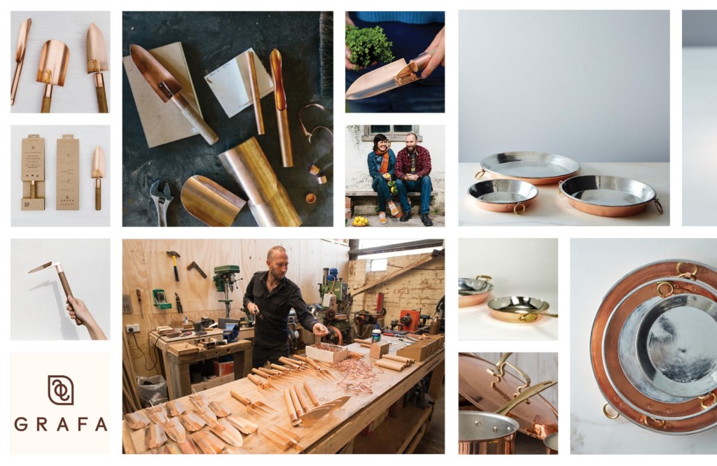
Grafa produces fine artisan gardening tools from reclaimed and up-cycled copper, that not only look beautiful but also benefit the environment.
Objective:
Develop a brand extention that compliments and leverages from the existing reputation, company strengths and consumer expectations.
Concept ideation:
These vintage inspired pie pans [pictured] are what I chose to use for the Grafa brand extention – as they would be a perfect accompaniment for the considered gardener and cook.
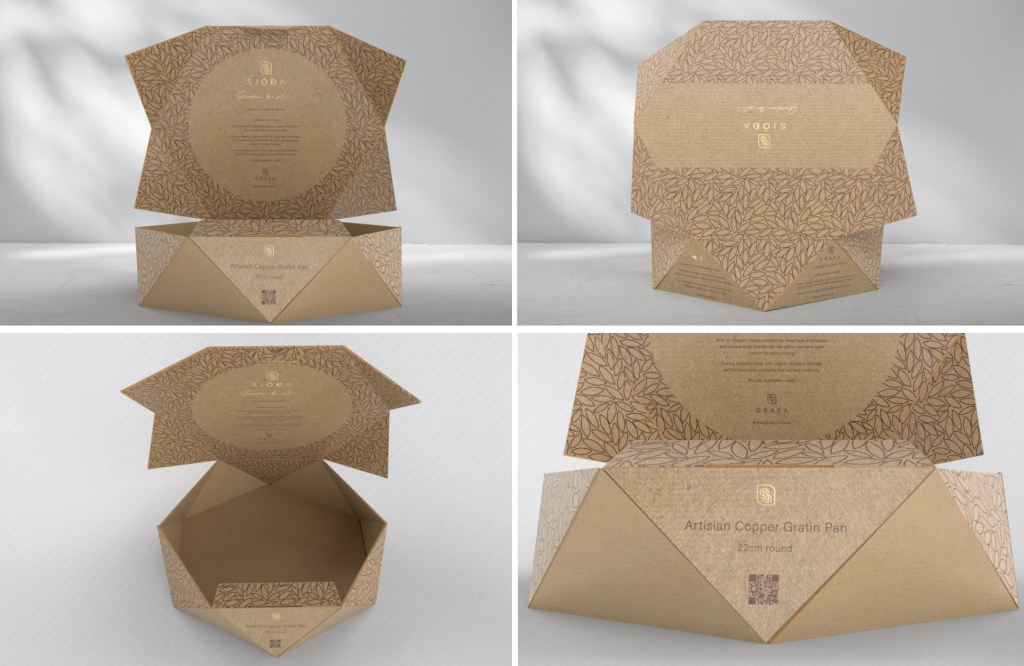
I decided that the sub-brand would follow the nordic ethos of the main brand name, Grafa, which means to dig. I looked at verbs that would suit the product extension of ‘garden to plate’. Once I converted these into the Icelandic Old Norse language, I settled on sjóða which means ‘to cook’ and will suit a range of products for the brand extension.
The font style was to be kept clean and simple, much like the original brand. I searched for grotesque sans serif fonts as it suits the raw but also contemporary style. The brand-mark is also inspired by nordic symbols to enhance the connection between the main brand and sub-brand.
Outcome:
Process steps:
- Create a sub-brand for the brand extension
- Select a product for the brand extension
- Review competitor products
- Generate detailed consumer profiles
- Packing form sketches and paper prototyping
- Create packaging concept mood boards
- Refinement of sketches and paper prototypes
- Generate brand identity
- Create diline and technical information using Adobe Illustrator
- Create surface graphics using Adobe Illustrator
- Generate a 3D model using Blender
- Research packaing and filler materials and suppliers
- Finalise packaging dieline output.

Leave a comment